Python 如何繪製統計圖表?
這篇文章主要介紹如何用Python 的套件,寫少數的程式就可以完成統計圖表。
這個統計圖表繪製的套件主角就是 “pygal”
安裝pygal
如果是 Windows 執行
| pip install pygal |
Mac or Linux
| sudo pip install pygal |
繪製Bar Chart
透過這個套件,可以很容易的繪製出所需的圖表
輸出的檔案格式為SVG,可以使用瀏覽器檢視,圖表的值也會在 mouse moveover 之後顯示
[pastacode lang=”python” message=”Bar Char in Python” highlight=”” provider=”manual”]
# -*- coding: utf-8 -*-
import pygal
#create a new bar chart.
bar = pygal.Bar()

bar.title = 'This is my Bar chart title'
bar.x_labels = map(str, range(2011, 2015))
bar.add('Value', [5, 10, 1, 13])

bar.render_to_file('bar_chart.svg')
[/pastacode]
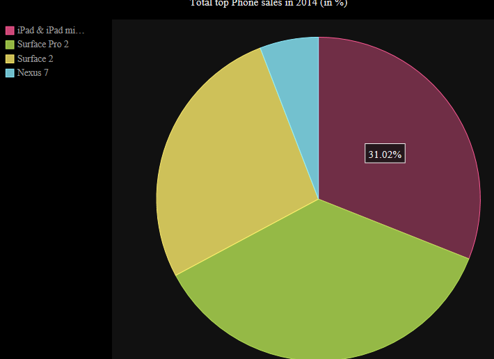
繪製Pie Chart
[pastacode lang=”python” message=”Pie Char in Python” highlight=”” provider=”manual”]
pie_chart = pygal.Pie()
pie_chart.title = 'Total top Phone sales in 2014 (in %)'
pie_chart.add('iPad & iPad mini', 39.7)
pie_chart.add('Surface Pro 2', 46.3)
pie_chart.add('Surface 2', 34.5)
pie_chart.add('Nexus 7', 7.5)
pie_chart.render_to_file('pie_chart.svg')
[/pastacode]
參考資源
除了這個 lib可以提供統計繪圖之外,還有其他選擇嗎? 有的!
• matplotlib can be found at http://matplotlib.org
• pygal can be found at http://pygal.org
• Plotly can be found at https://plot.ly
• PyChart can be found at http://home.gna.org/pychart/
• iGraph: can be found at http://igraph.org/redirect.html
• NetworkX can be found at http://networkx.github.io